isotype
Our isotype is an extension of our logo, distilled down to its purest essence. The isotype can be used as a favicon for browser tabs, as social media avatars or as a secondary graphic for swag.


logo don'ts
Our logo works best when it is consistently used correctly. Consistency is not only great for your logo but also for your participants, stakeholders and brand awareness. The examples below are what NOT to do with your logo.

🚫 Change the circle shape

🚫 Use a drop shadow

🚫 Use horizontal mark in logo

🚫 Rotate or turn the logo

🚫 Change the adinkra symbol

🚫 Stretch or skew the logo

🚫 Place on a busy background

🚫 Use non-designated colors

🚫 Place logo in low contrast
primary palette
The FMoD color palette is a vibrant reflection of our community’s energy, creativity, and spirit. Each color was chosen to capture the essence of what makes the Free Market of Detroit so fun and unique.

orchid
HEX F840A7
RGB 248, 64, 167
HSB 326, 74, 97
CMYK 0, 74, 32, 2

sunshine
HEX FDE115
RGB 253, 225, 21
HSB 53, 92, 99
CMYK 0, 11, 91, 0

kiwi
HEX DEFA67
RGB 222, 250, 103
HSB 71, 59, 98
CMYK 11, 0, 58, 1

cyan
HEX 75EAE6
RGB 117, 234, 230
HSB 178, 50, 92
CMYK 50, 0, 1, 8

chocolate
HEX 532022
RGB 83, 32, 34
HSB 358, 61, 33
CMYK 0, 61, 59, 67
secondary palette
Our secondary color palette is designed to complement the primary color palette with additional depth and range.
These colors should be used sparingly in order to maintain a consistent and recognizable color story for the FMoD brand.

magenta
HEX C00770
RGB 192, 7, 112
HSB 326, 96, 75
CMYK 0, 96, 41, 24

mustard
HEX E8CD02
RGB 232, 205, 2
HSB 53, 99, 91
CMYK 0, 11, 99, 9

apple
HEX 7E9905
RGB 126, 153, 5
HSB 71, 97, 60
CMYK 17, 0, 96, 40

dark cyan
HEX 158A86
RGB 21, 138, 134
HSB 178, 85, 54
CMYK 84, 0, 2, 45
typography
Just as the Free Market of Detroit logo and color palette reflect our community's vibrancy and values, our typeface plays a crucial role in conveying our brand’s personality.
Our chosen typeface, Poppins, embodies the qualities that define the Free Market of Detroit: it’s modern, versatile, and approachable. With its clean lines and geometric precision, Poppins is both friendly and sophisticated, making it the perfect choice to represent the spirit of our swaps and the community we’ve built.
Use Poppins for all primary brand communications. Its flexible nature allows it to be used effectively in headlines, body text, and everything in between, always ensuring our words resonate with the same warmth and creativity that define FMoD.

main header
poppins black

secondary header
poppins extra bold

subhead
poppins bold

body copy
poppins medium
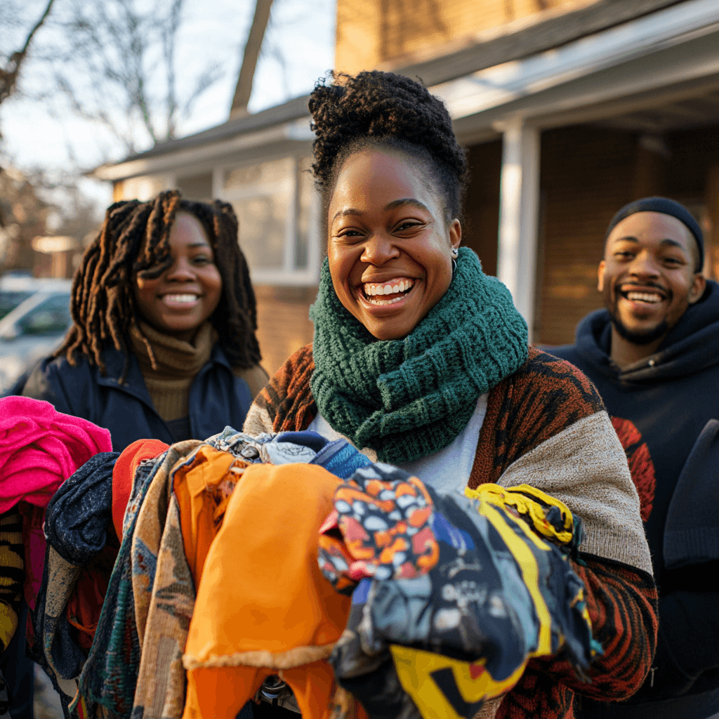
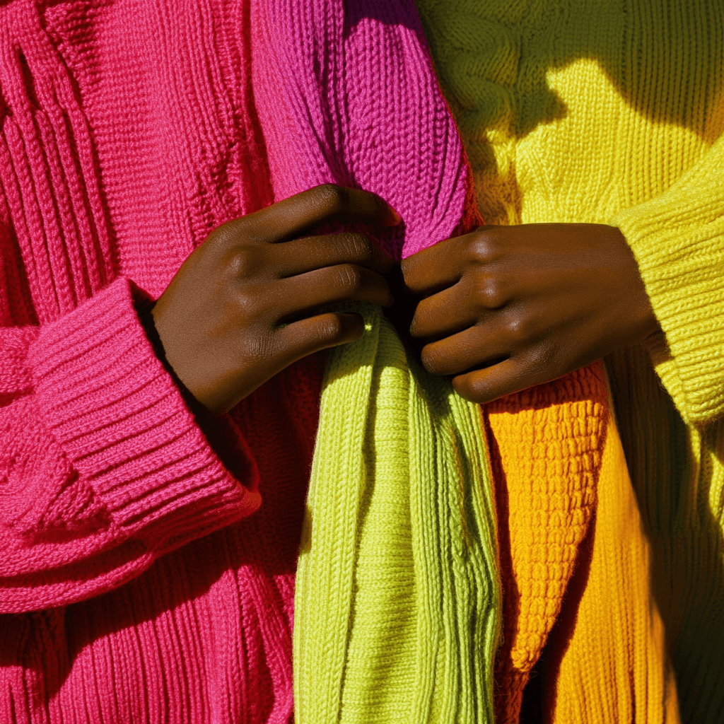
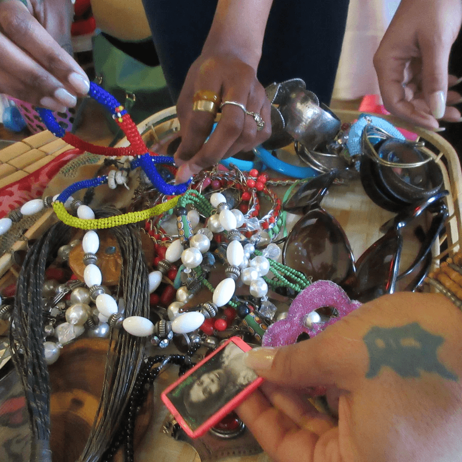
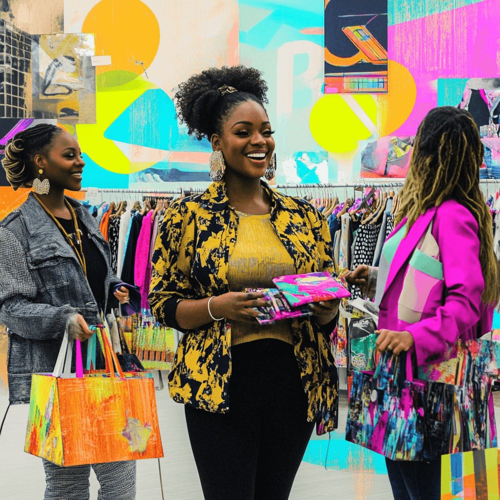
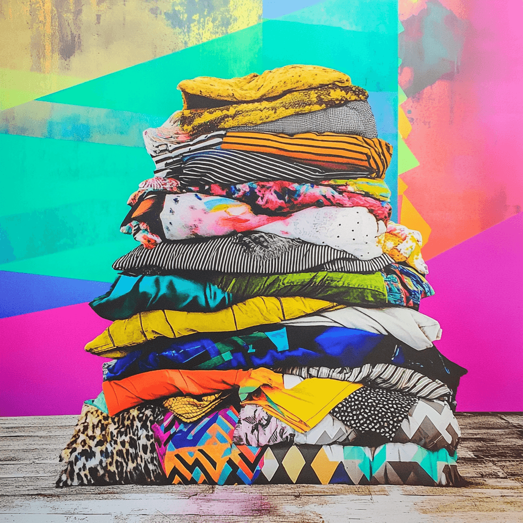
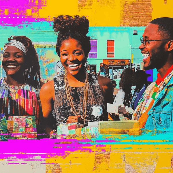
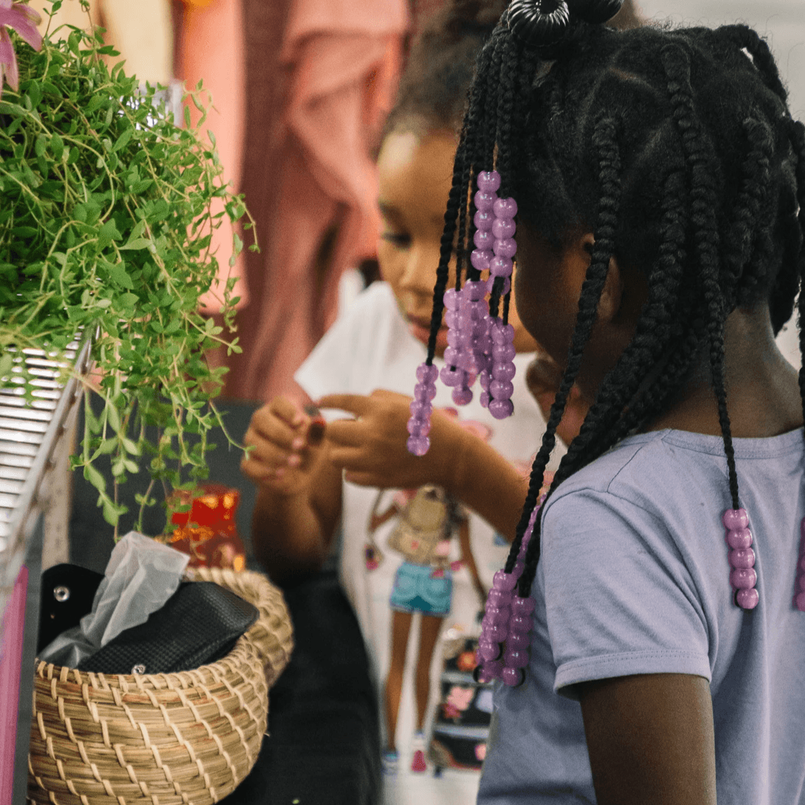
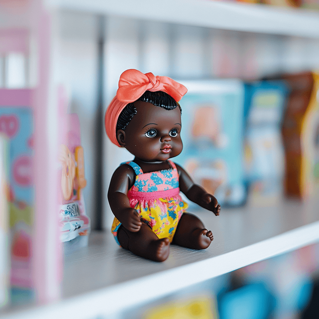
imagery
FMoD imagery should capture the warmth, creativity, and inclusiveness of our community. Use natural lighting with warm tones to create an inviting atmosphere. Focus on real moments of connection—people interacting, sharing, and enjoying the swap experience. Highlight our community's diversity and the hands-on nature of our events, with close-ups of unique items and shared laughter.
Images can also be enhanced with post-modern collage elements to add to the appeal and fun. Align visuals with our vibrant color palette, subtly incorporating brand colors to maintain consistency. The overall mood should evoke joy, creativity, and a strong sense of community.